a.k.a. thinking through thinking,
overthinking through overthinking.

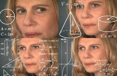
Last week = chaaaaaooooosssssssss!!!!!
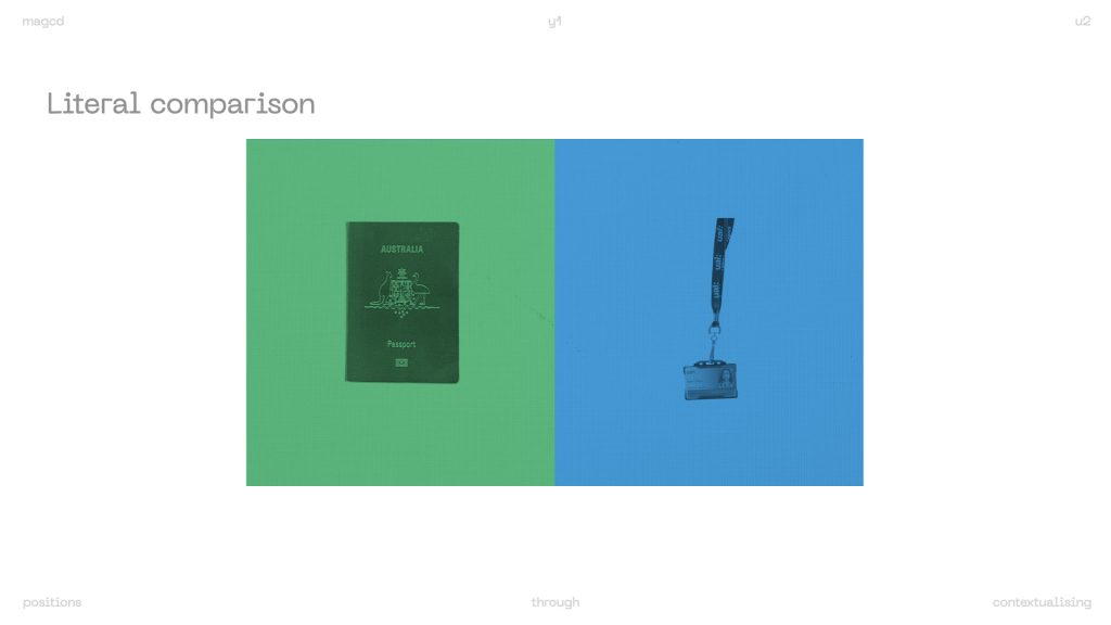
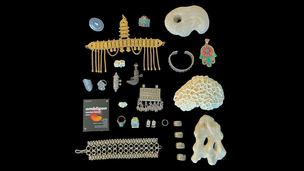
Visual representation of me looking at my research:
The feedback I got last week was to focus on one thing to tighten my line of enquiry. zarna suggested focusing on objects as that seemed to be the core concept tying all of my ideas together. I agreed with this advice, and also liked that it would push me back towards a visual direction, because looking at theory and research thus far didn’t provide me clarity.
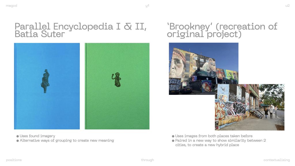
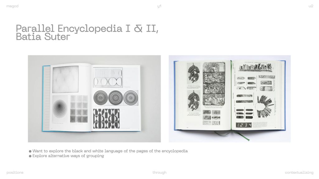
last week one of my peers presented batia suter’s ‘parallel encyclopaedia’, and I decided to look into it further because it seemed relevant to my research thus far. it reimagines found images from books, exploring how existing visuals gain new meanings through fresh contexts and associations. I was also inspired by the visual language of the encyclopaedia.
“It’s similar to the language of dreams. It’s fast, associative, non-rational. I create unexpected connections between images to generate new meanings. I’m not trying to explain everything verbally, but to provoke a visual experience. A language that operates beyond words, touching something more fundamental in human experience.” – Batia Suter
also, last week during the cross-year studio, I was also introduced to ‘Brookney, A Place in Between’, by Jūratė Gačionytė. They used images they had already taken of both Brooklyn and hackney, places that they felt were similar in some regards, and created a publication with an image from both suburbs on each facing page. They were paired loosely, i.e. spotting similar objects such as a pipe on a wall. this then started to create a new space in between them, a hybrid space they dubbed ‘brookney’. I used this as a reference because it linked to my own hybrid identity. (I didn’t have access to the images of the project because it was an old student project presented during the lecture so I’ve recreated it in the slide above.)
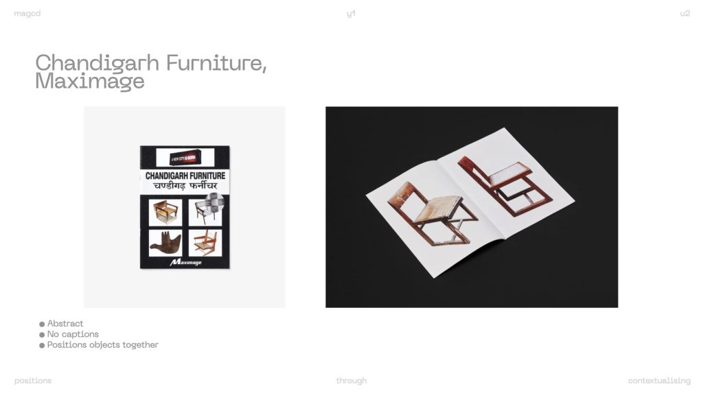
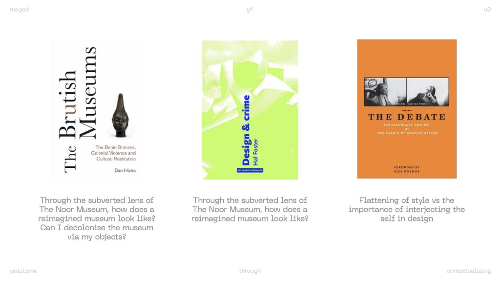
Another reference I found coincidentally was “Chandigarh furniture” which was part of the new collection in the csm library. though I was excited to learn more about the objects, I was disappointed that it was an image book that paired images of chairs on plain backgrounds that allowed the reader to form open-ended stories about the objects. a stream-of-consciousness style text is placed as an interlude in the middle of the book, seemingly written from le Corbusier’s POv (the city’s architect). it felt confusing and provided no clarity. but the abstraction was intriguing because I was given space to project my own understanding onto the objects, and by way of that, the city of Chandigarh.
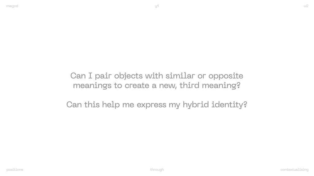
^initial guiding questions for my iterations. Kind of the parameters, but I knew I wanted to specifically subvert the visual style of the parallel encyclopaedia.
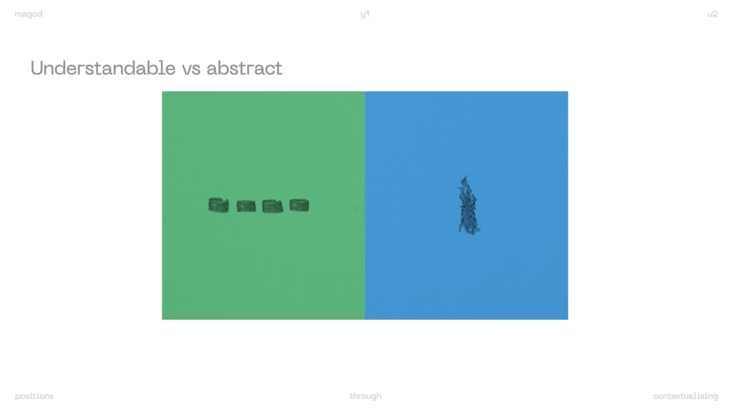
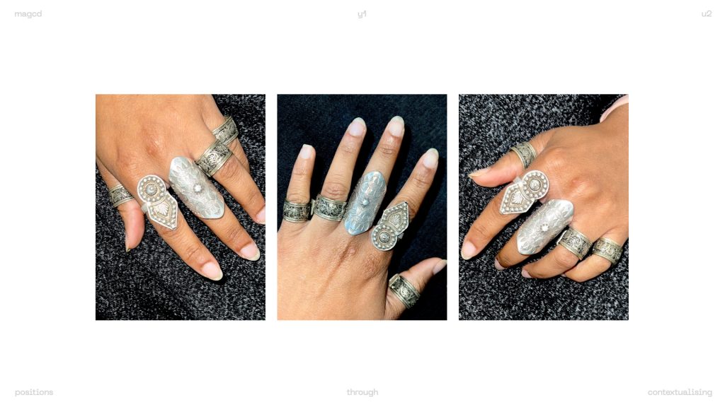
for example in the above iteration, I questioned whether the image of the 4 rings clarifies that the object on the blue panel is a finger/nail accessory, or if the finger accessory abstracts the image of the 4 rings.
I also started to wonder…
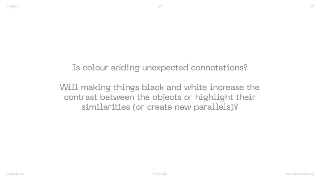
But that led me to consider…
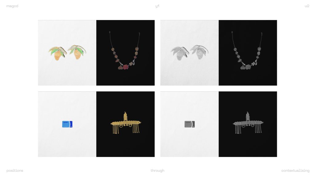
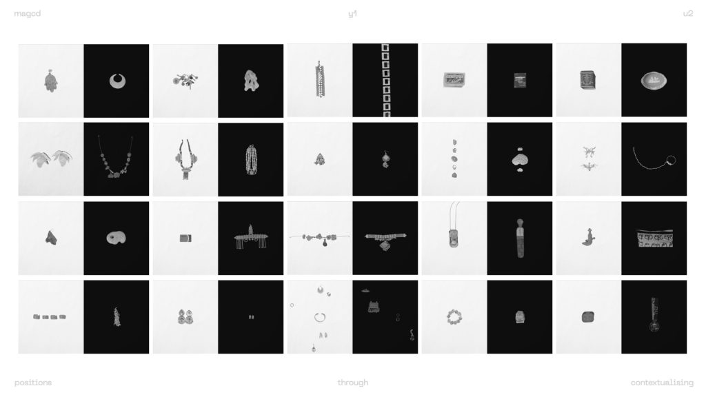
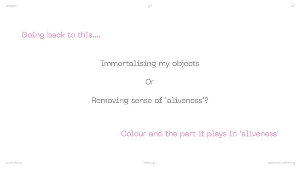
by comparing the colour vs greyscale spreads, I was able to see how this was taking effect. it seemed by removing colour, I was also removing myself from the narrative.
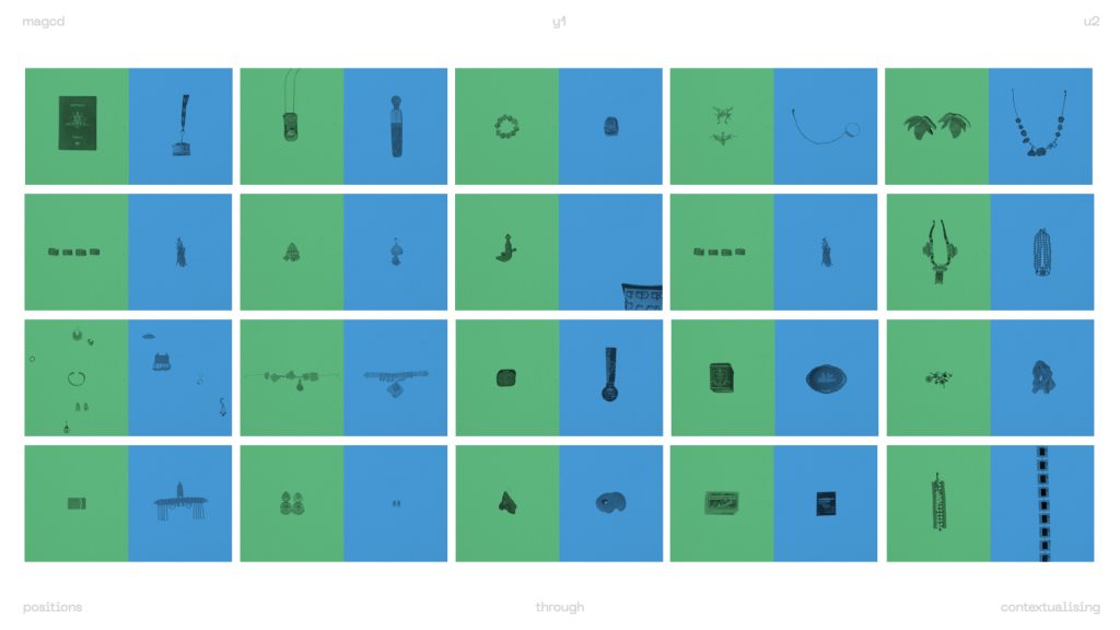
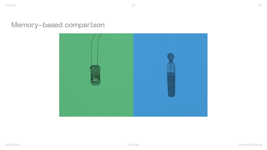
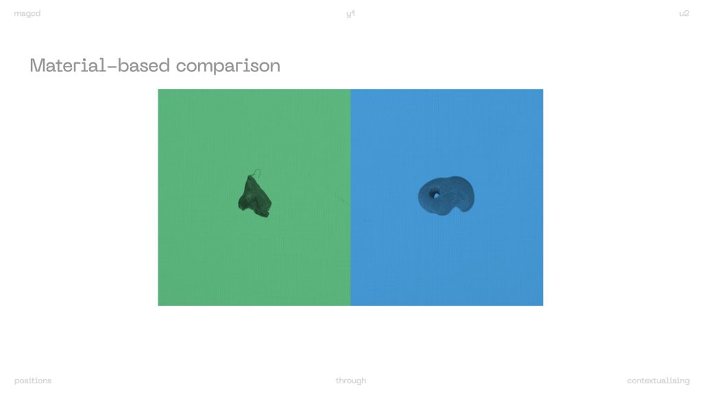
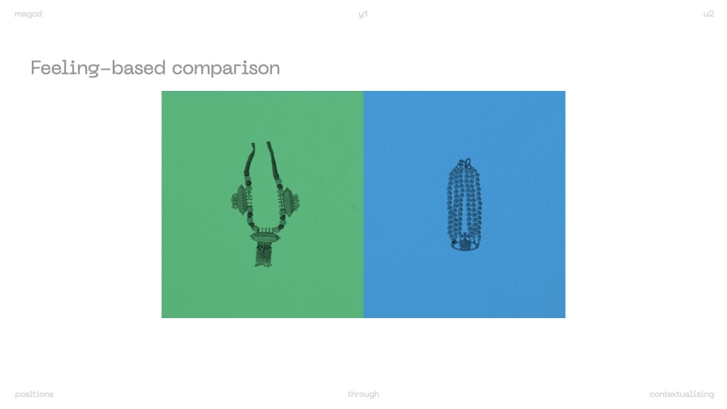
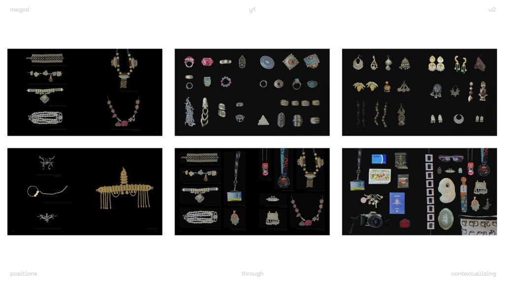
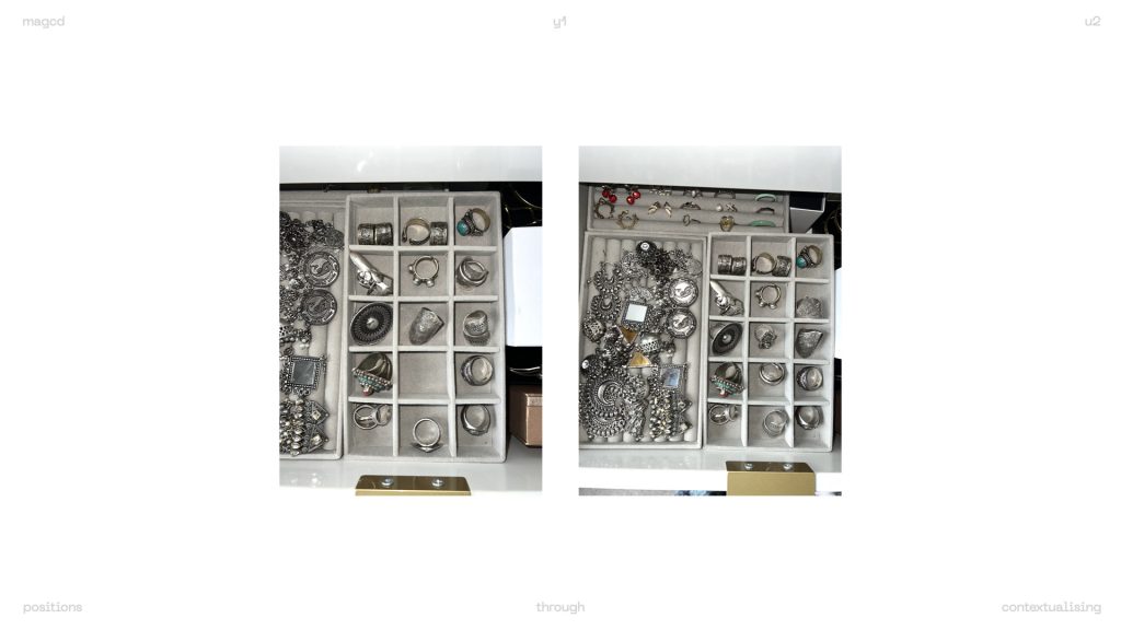
something else I wanted to explore from the parallel dictionary was the concept of grouping, not just emulating the visual style of the cover. I decided to look at the pages within.
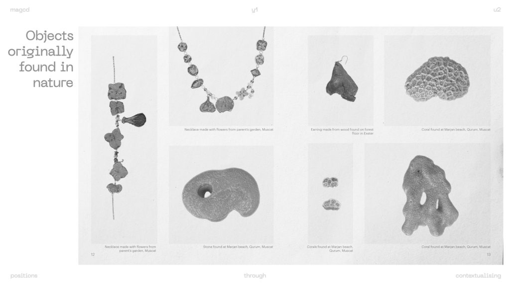
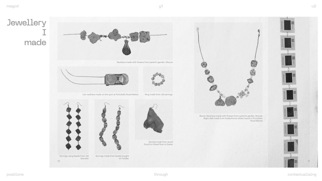
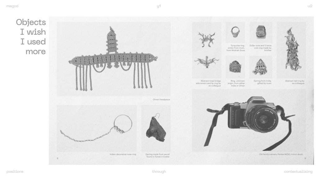
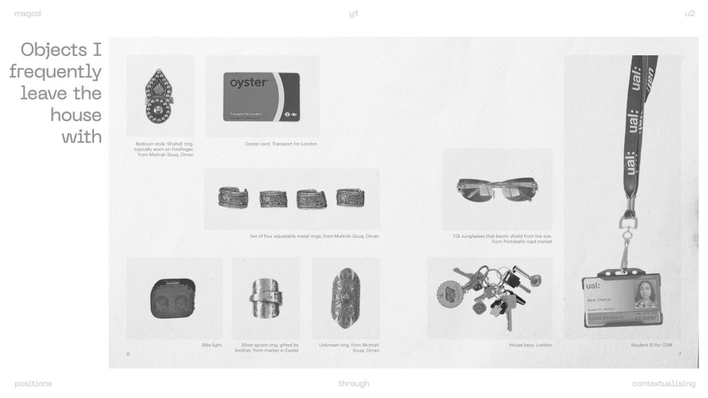
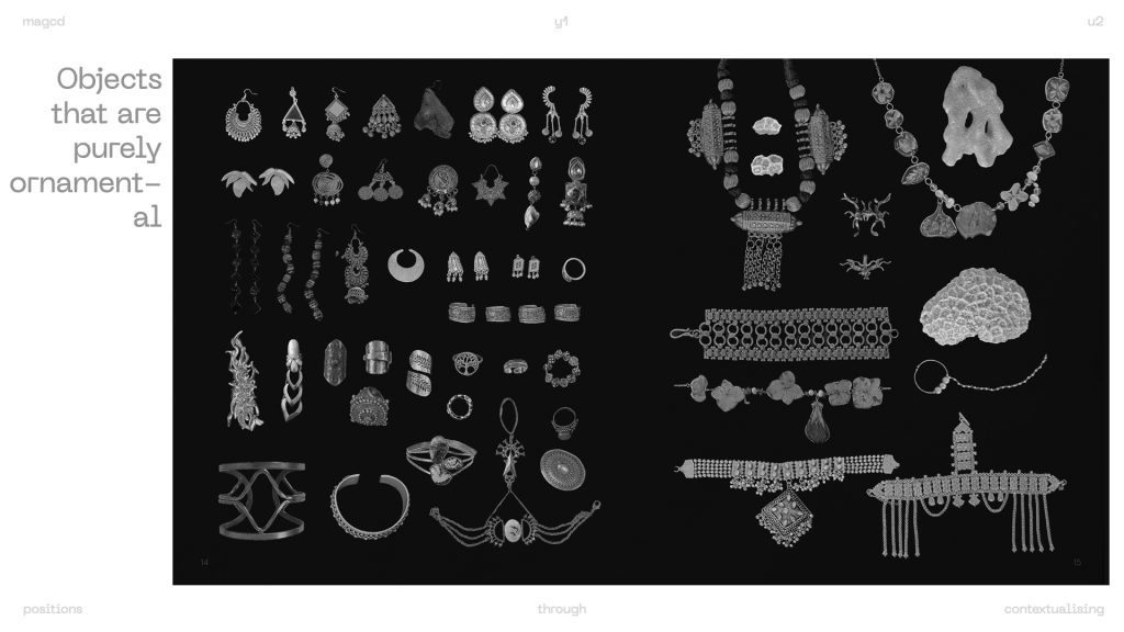
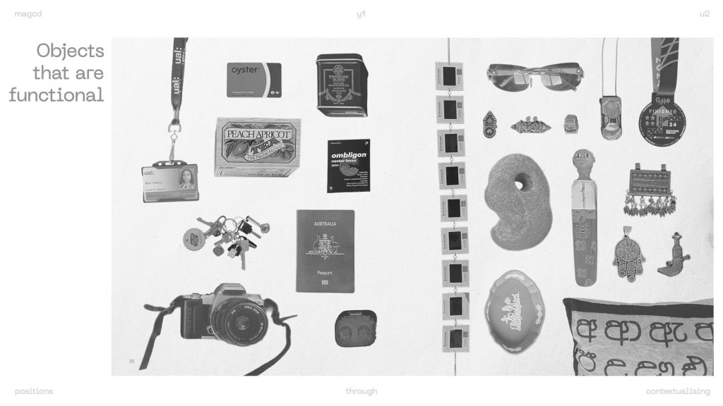
at the end of positions through iterating I found myself grouping objects via place of origin, thus injecting into the narrative what they mean to me. I wanted to re-group the objects in new categories, some of which were more objective and literal, others which were personal ways of categorising. I intentionally didn’t include any titles or context per spread, except for captions describing the objects, so the meaning is left for the viewer to interpret (or project onto the images).
I also revisited the above question to take my iterations further/into a new direction.
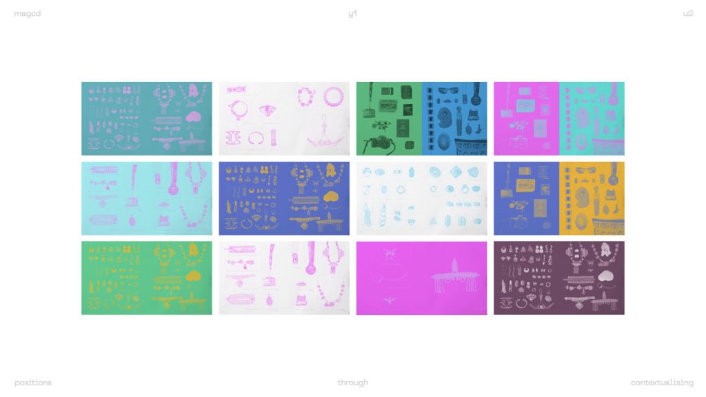
p.s. can you tell I love playing with colour? I really want to explore riso!
separately, In my feedback last week (and the week before), i was encouraged to explore museum aesthetics and language, and Create a museum of my own objects, emulating the role of a curator.
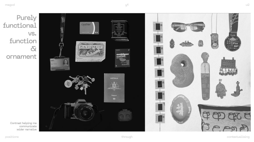
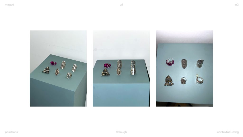
the way I had previously laid out my objects was reminiscent of museum display cases. see below:
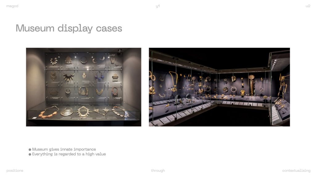
I also reflected on the fact that when I’ve visited the India or Middle East sections of the British museum or the v&a, some of the objects on display are very similar to pieces of jewellery I own which are tucked away in my drawer.
I was intrigued as to how the nature of museum display cases increases the perceived importance of certain objects. I also decided to explore grouping via function, to further remove any projected meaning.
Although my voice is only that of the curator, the objects become removed from their stories and my lived experiences attached with them. it is perhaps the format of the museum as an institution that projects this meaning. even though these are my own objects, they feel like relics of the past or of another culture.
it reminded me of the argument Van Toorn presented in ‘the debate’ (see below):
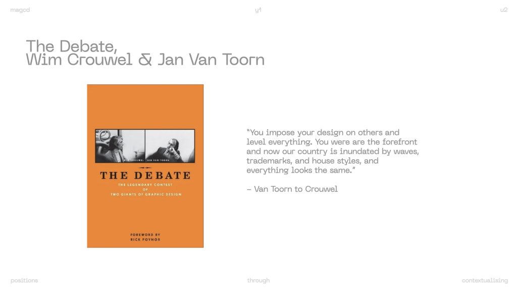
museums are institutions that follow specific conventions which inherently project meaning onto the objects. what would a museum created by me look like? well, not like a typical museum for sure. but, to change order, you have to first understand what creates the order.
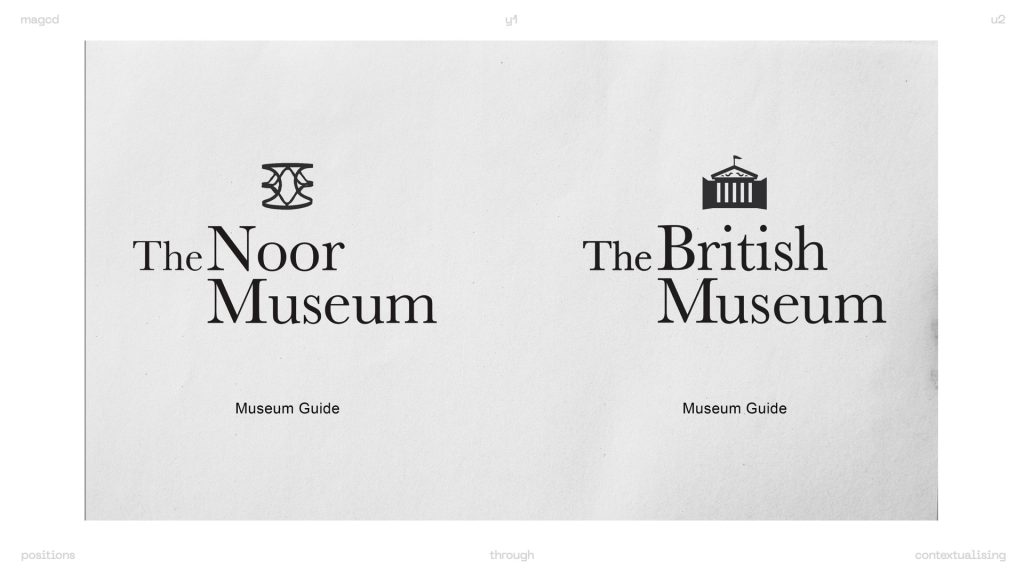
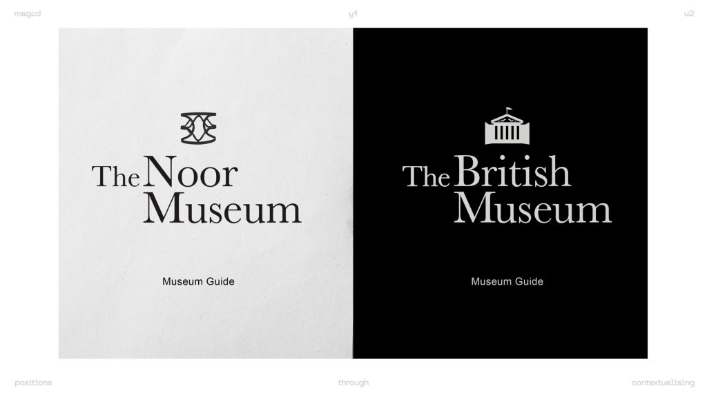
I decided to explore other conventions of museum language and subvert it, creating an almost fictionalised museum.
warning: this is where the project becomes self-indulgent. but we love it.
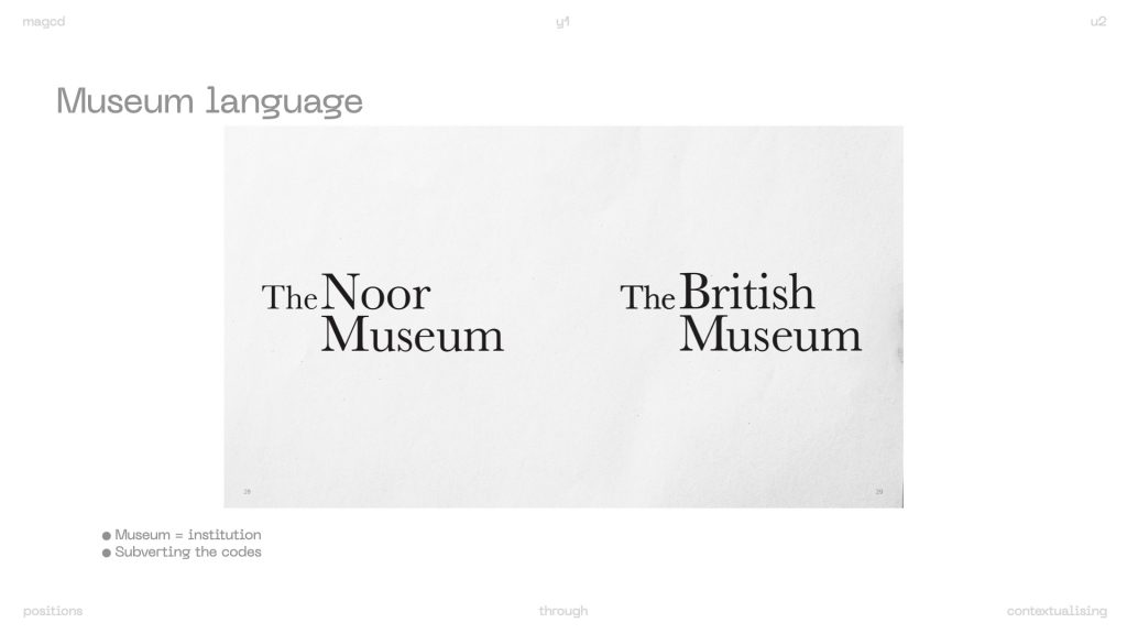
I specifically chose the British museum, a museum well known for displaying artefacts acquired through questionable means and colonial theft, and refusing repatriation.
“Young people in particular use the British Museum now as a kind of shorthand for colonial theft, and even people I know who rarely visit museums or have much interest in them know about the British Museum as a ‘thief’. Memes about the museum’s apparent kleptomaniac ways pop up online fairly frequently, in fact, a simple Google search for ‘British Museum meme’, will flood your page with critical images of the kind.” – The Big, bad British Museum, the artful historian via medium
thus I embarked on the journey of rebranding the British Museum to create ‘the Noor museum’.
re-introducing contrast as explored in earlier iterations.
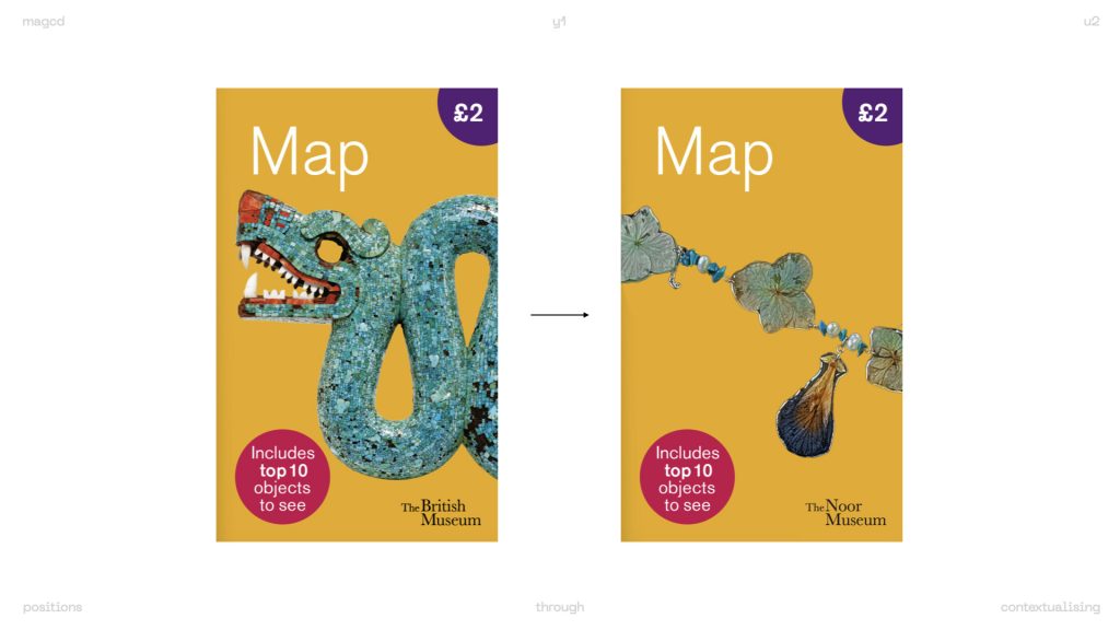
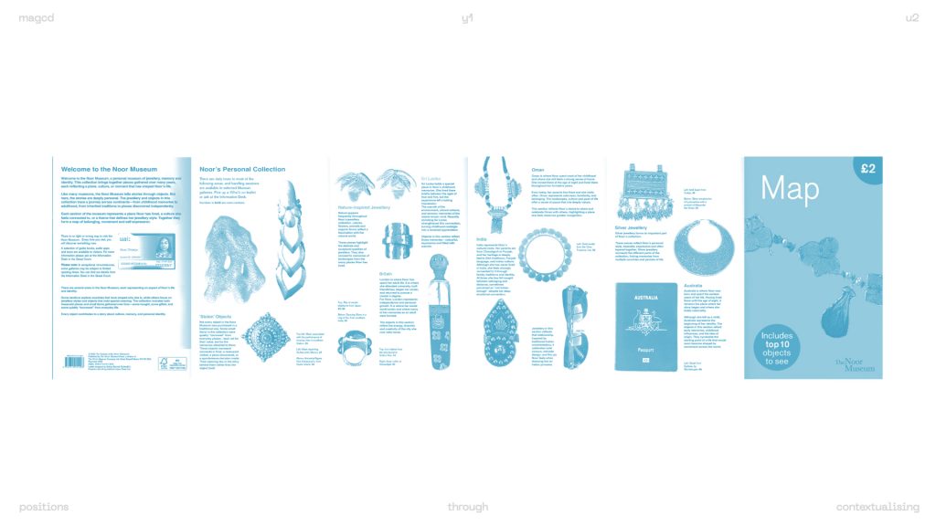
changing colour… mimicking riso zines that was a format for cheap and accessible printing. flattening of objects but less serious than black and white.
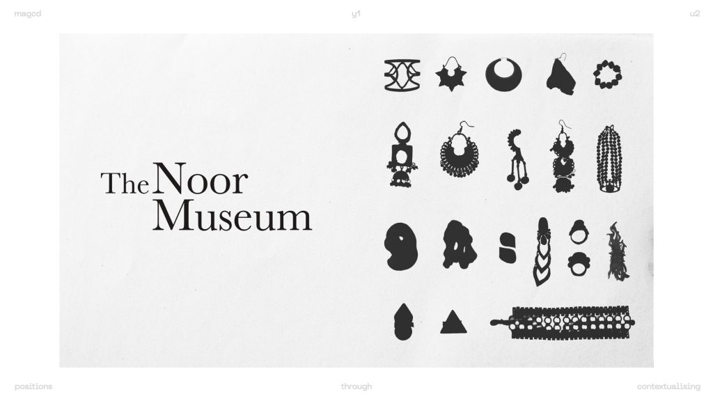
in museum (re)branding, typically the designer would make icons displayed in the space too. I decided to experiment with using my objects to make icons. (objects as symbols). i need to explore this further, see what each symbol can represent, so I’ve bookmarked this for now.
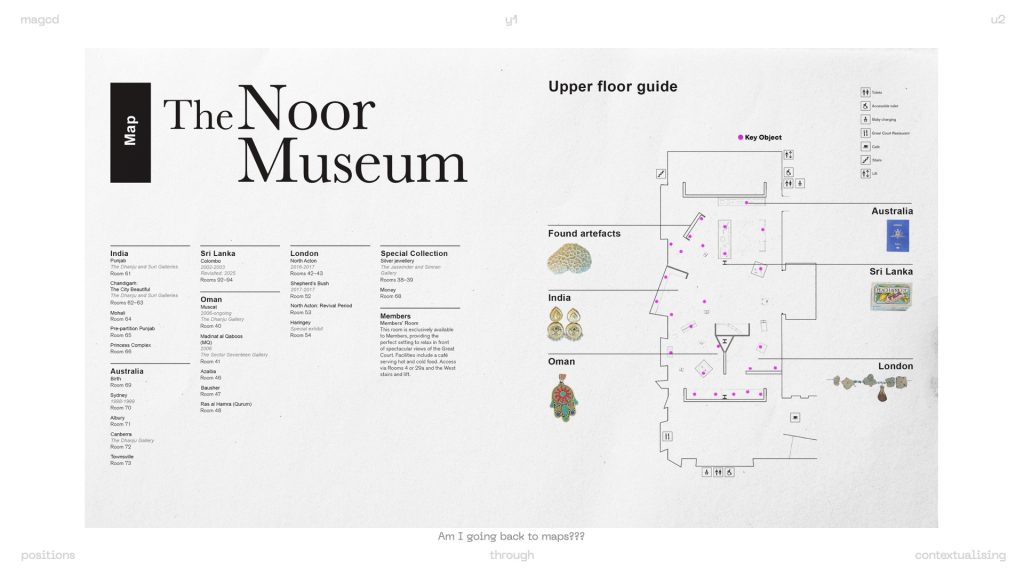
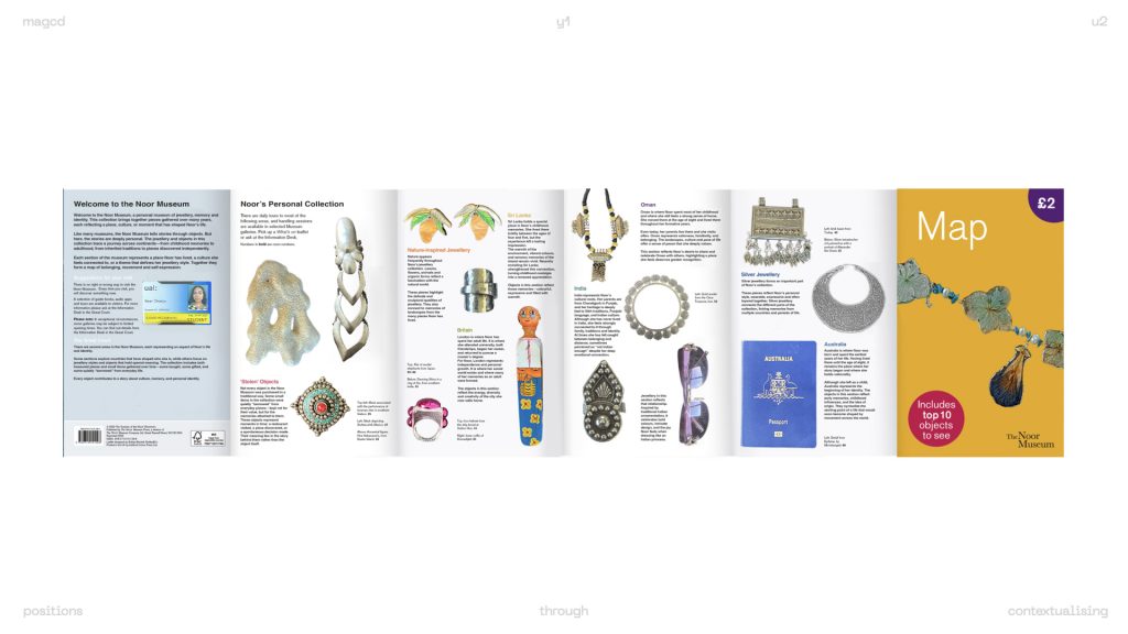
recreating a museum guide/map with details and placement that I would choose as the creator and curator of a museum.
why this works is because by co-opting the various formats of museums, I’m seeing how my objects have to be separated – from myself and each other. the conventions lend itself to that, no matter now much subjectivity I attach to it. the objects belong not just to me, but to everyone.
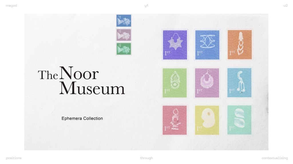
museums also often display ephemera, something that I’ve always been drawn to due to my work with visual communication. ephemera are by nature disposable and fleeting, but once displayed in a museum, suddenly they become important artefacts that aid us in understanding habitudes of specific communities or places. this is why I decided to create my own stamps, replacing images of queen Elizabeth ii with my own objects – meaningful to me.
another lens I wanted to explore through my iterations was changing context around objects. a lot of the items I chose are pieces of jewellery, meant to be worn and lived in. thus I questioned:
explored the changing contexts of the shahid ring from Oman.
museum conventions – important, but detached from human experiences.
I used flash because museums often prohibit flash photography.
worn, dynamic, lived in, how the item should be used. human vs object – which one speaks to us more? does the object make sense without the conventional ways in which it’s used?
where the item is usually kept, vs the object missing from its “home”. it seems ordinary, one of many. not an item to be revered.
other places the objects dwells. it feels ordinary but also forgotten.
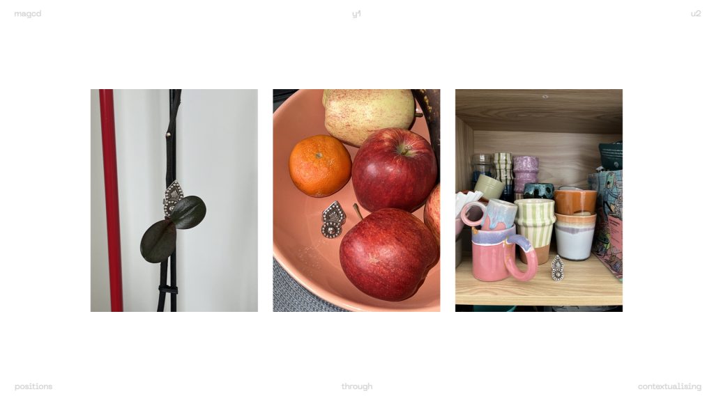
odd places. places I don’t think I would actually see the object. but what does this say about both the object and me? it’s so tiny, but you can’t miss it. it stands out.
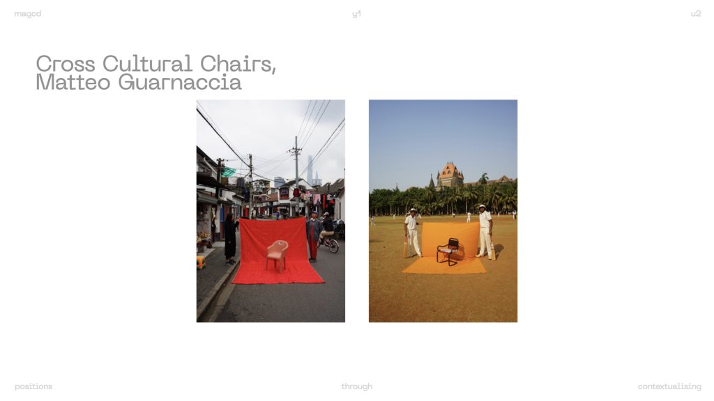
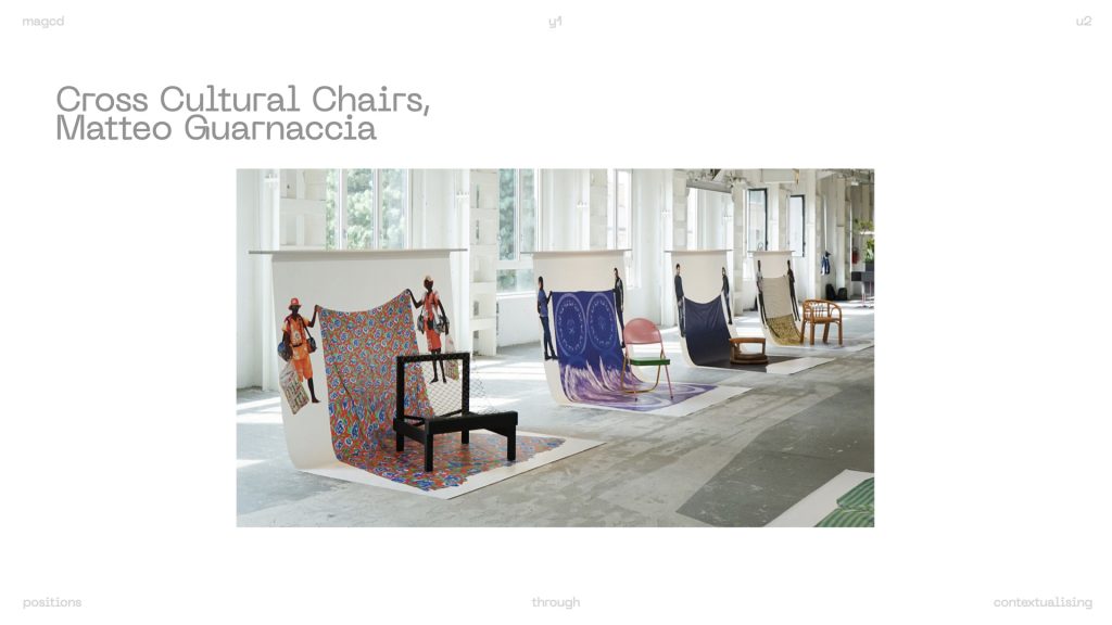
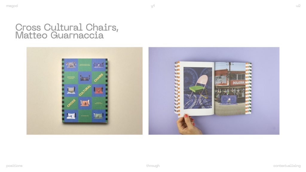
this week I really focussed on the iterations to push me forwards, so I still have to narrow down my 2 key references, but here are some of the important ones:
also:
notes from the thought log I kept while creating this week’s iterations. I need to explore “design & crime” by hal foster further, removing ornamentation, and also iconification of the self.
another reference I want to explore further:
feedback:
- Great job iterating, objectifying your objects, the object becomes speculative and our ownership disappears
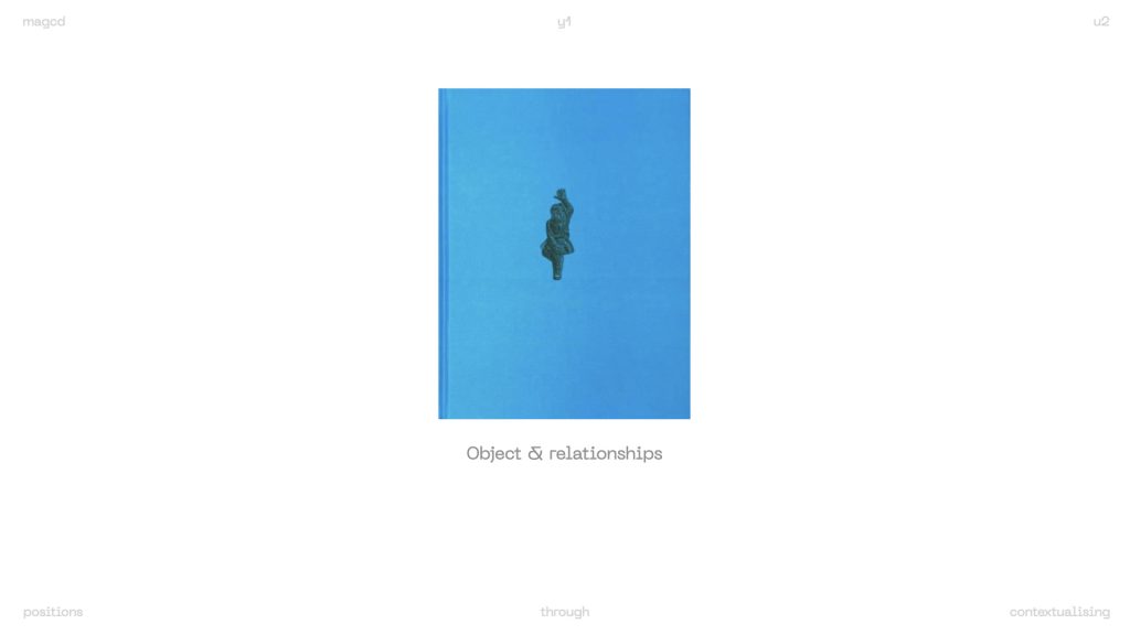
- The Brutish museum is a good ref to use for your writing, making a personal collection less personal
- Hew Locke: what have we here?
- What happens when you do historical academic analysis of it? + Hew Locke’s work
- What is the academic way? What does that look like as a container? Flattened to object, text, caption
- How do you engage with all those different layers with one thing
- Language and objects can be contested
- Without personal language the exhibit creates disconnection
- The use of British museum language works out perfectly
- noor: what I need to first explore for next week is adapting the text displayed next to objects in museums, find references of that, like the one Zarna showed with cards covering existing information placards with more details about the heritage of items. and then search for references for a graphic exploration of that, how can I communicate levels of abstraction or subjectivity in information placards displayed at museums? what would be the best way to represent it? a book? a leaflet?
Leave a Reply